ILLUSTRATION
Click on images to see details.
GALLERY
DETAILS
"Blessing" serie
Finished on JUNE 2021
It's a serie of illustration using the "Blessing" color palette; you can find more about it by clicking this image:

I've done some pixelart in the past, and I retain for this art form an interest for limited color palette.
This palette I found particularly interesting: the vibrant, acid yet pastel color that seems disjointed, but can come together beautifully in the piece. No color here is the perfect shade of the other, so you need to get really creative to make highlight and shadows work.
This serie of illustration pushed me to experiment more, while making sure the image is readable and interesting to look at, despite the weird and limited color palette.
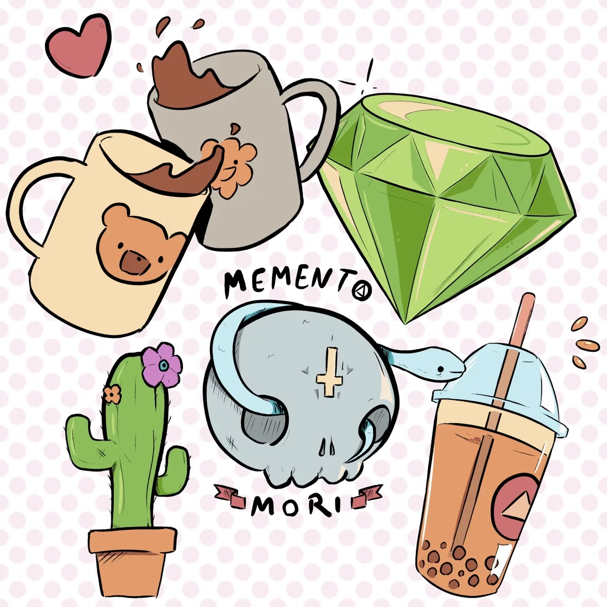
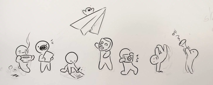
Inktober 2021 - Stickers
Finished on October 2021
Like every year, I wanted to participate in the Inktober challenge. People generally participate by drawing one illustration a day for the whole month following a list of prompt; but in 2021 I wanted to do something different.
I decided to have a practical use for my drawings, by making them into little stickers afterward. I had some sticker paper lying arround, and I figure it would make a great gift for my friend and family.
So I asked arround for a list of request and prompt and got to work. For every one-word prompt I would draw at least 6 stickers, which often pushed me creatively.
I had to follow the prompt, but also think about what kind of stickers people would like to stick on their stuff. It pushed me out of my confort zone by making me draw themes and objects I would have never thought of on my own.
In total I created over 100+ stickers across 17 themes, fully colored and ready to print.
I printed and gave these stickers away during birthday, Christmas, or just to make someone smile; and they were a great success!
GRAPHIC DESIGN
Click on images to see details.
GALLERY
DETAILS
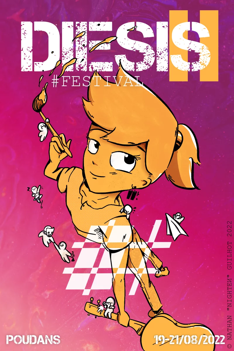
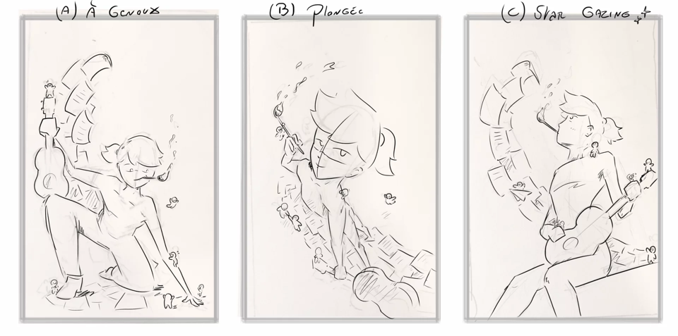
DIESIS #2022
Finished on AUGUST 2022
The Diesis # Festival is a multi-discipline festival organized right in the center of France, celebrating many art form such as drama, writing, music and art. In 2022 they held the second edition, and they asked me to come up with a poster to celebrate this year.
They gave me a lot of creative freedom, but I tried my best to communicate and structure my process.
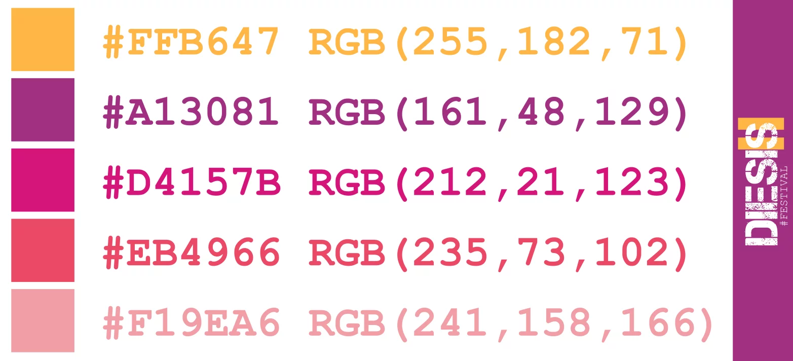
First, we worked together to define the color palette of this edition. The year before was a monochromatique orange, so this year I choosed purple to keep in the warm colors of summer, but added a white and yellow to add interesting contrast.
I then created a character based on the prompt "multi-discipline"; her name is Diez, and represent with her accessory both graphical art and music.
But to add variety and fun to the visual identity, I also created little mascot characters that each represent an art form. They were used in the poster, but also in various communication materials.
For the final poster, I presented the team with three possible composition. Even if they wanted to let me make my own creative decision, I felt this was important to hear their opinion and receive feedback early on before moving to the next stage.
After tweaks and back and forth, they were really happy with the final design.
This project made me excited to work on more poster and events in the future.
AVATAR/PORTRAIT
Click on images to see details.
GALLERY
DETAILS
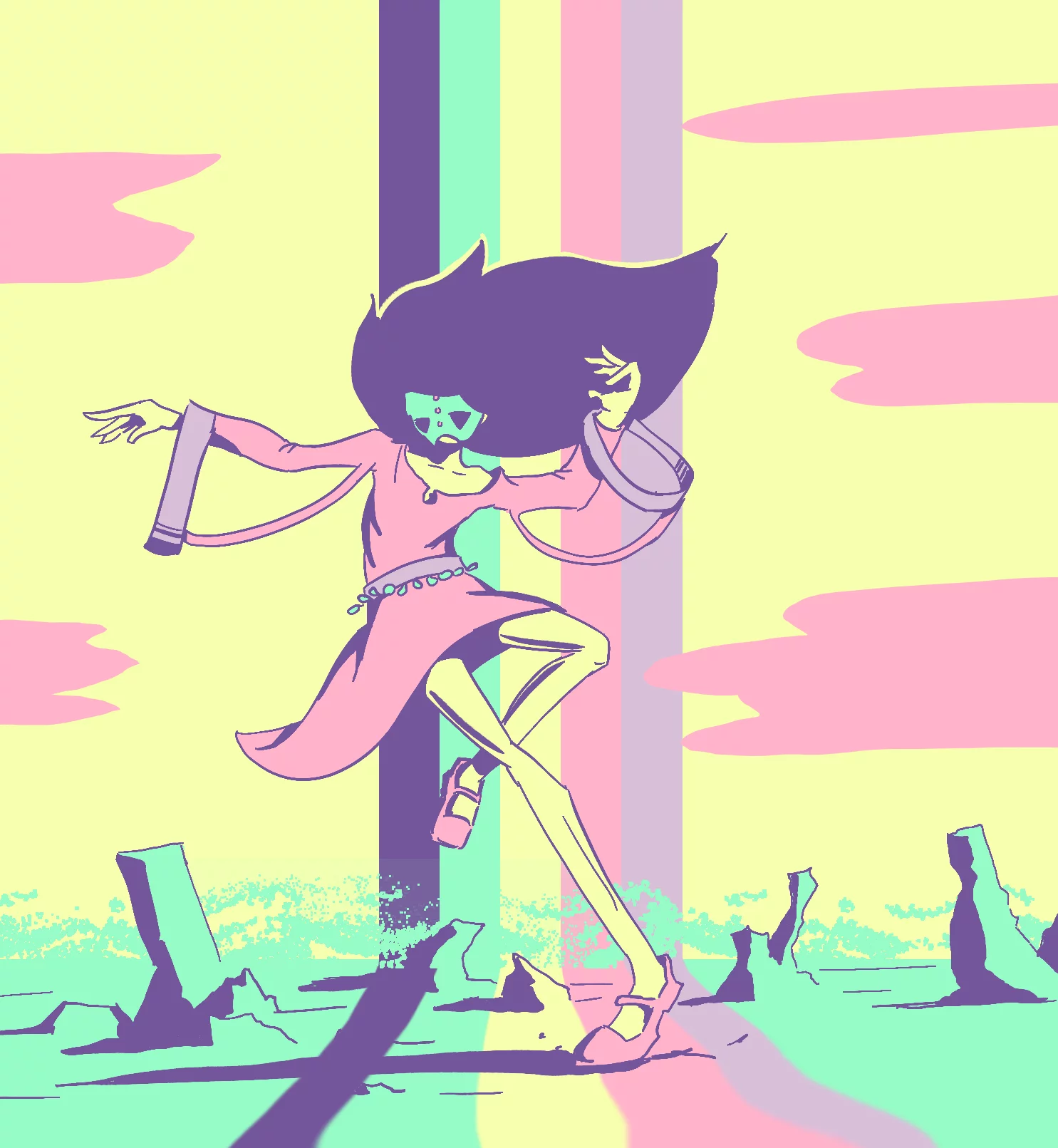
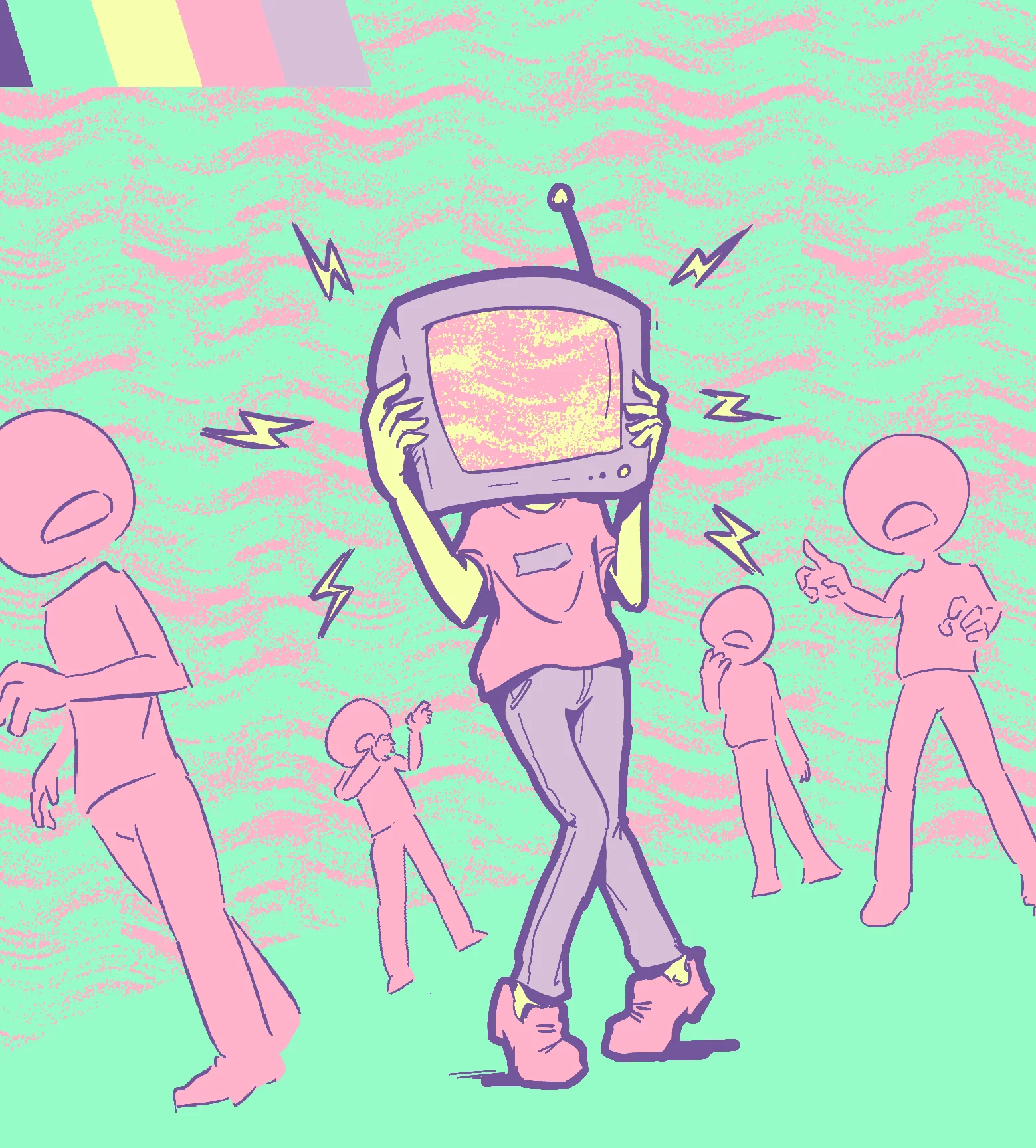
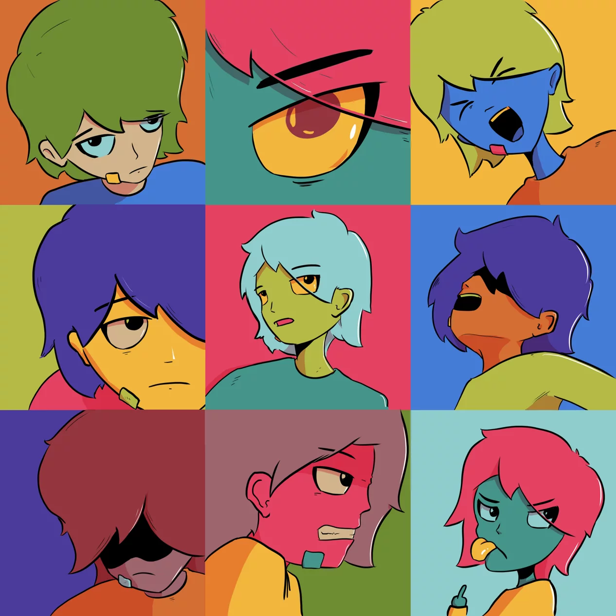
WARHOL MOOD
Finished on AUGUST 2022
A warhol inspired piece, representing shades of sadness and anger. I oscillate a lot between those two these days.
I enjoyed working with a limited, yet vibrant color palette. The trippy look hopefully transmit the emotion spiral I was trying to convey.
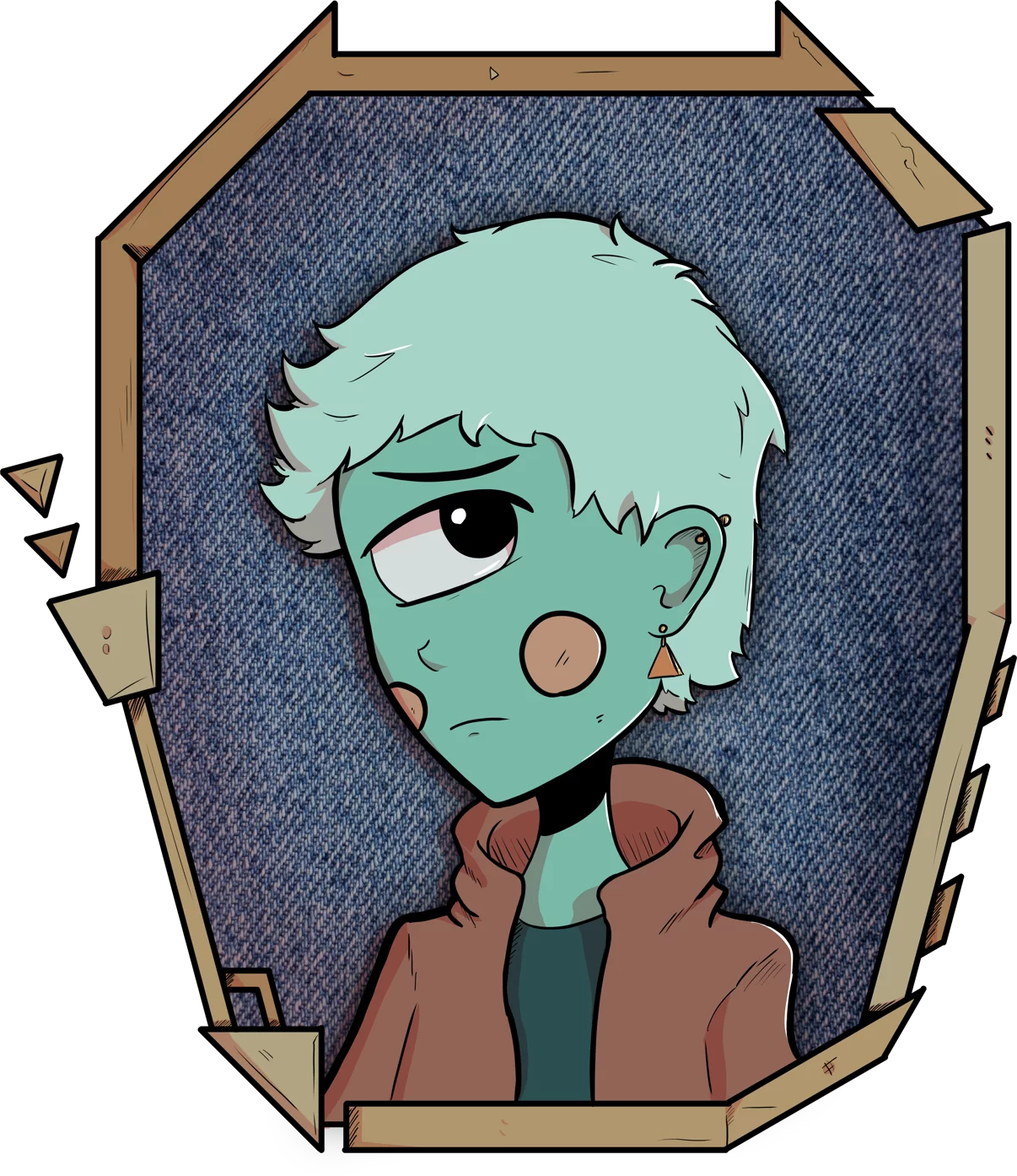
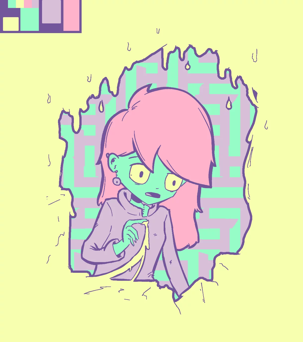
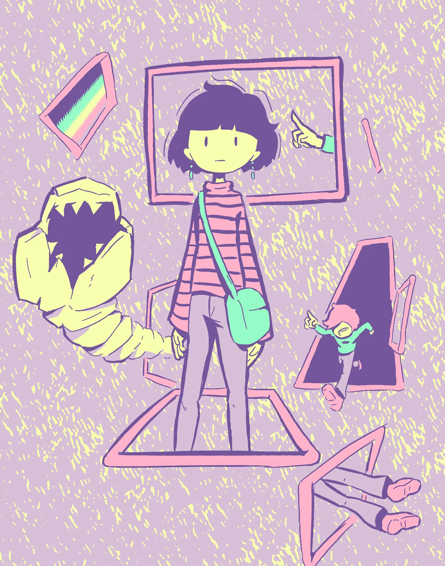
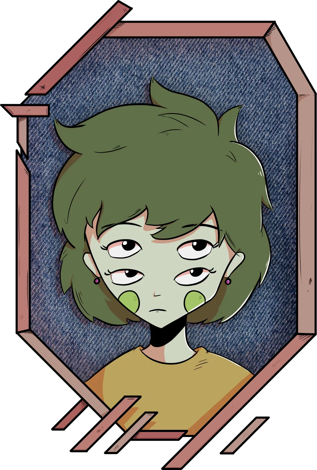
"Mirror" weird portrait serie
Finished on AUGUST 2022
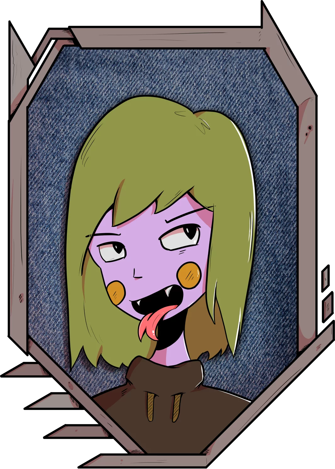
A series of quite particular portrait: I imagined a group of weird friends from a weird mutant world, each with their own personality.
The green girl with the four eyes is the one that fascinate me the most: with our very human sens, it's difficult to really understand what emotion she has: is she bored? Angry? Maybe a little curious? Sad? Depending on how you look at it, you can see quite a chaotic feeling. I really like that.
I also wanted to convey some of the character personality through their frames.
I don't have a name for them but I'm open to suggestion.